semrush’s
report export redesign
case study
Problem and goal
Users can export any report from any core Semrush tool. That’s the first and only time the majority of users interact with reporting. It looked like this:
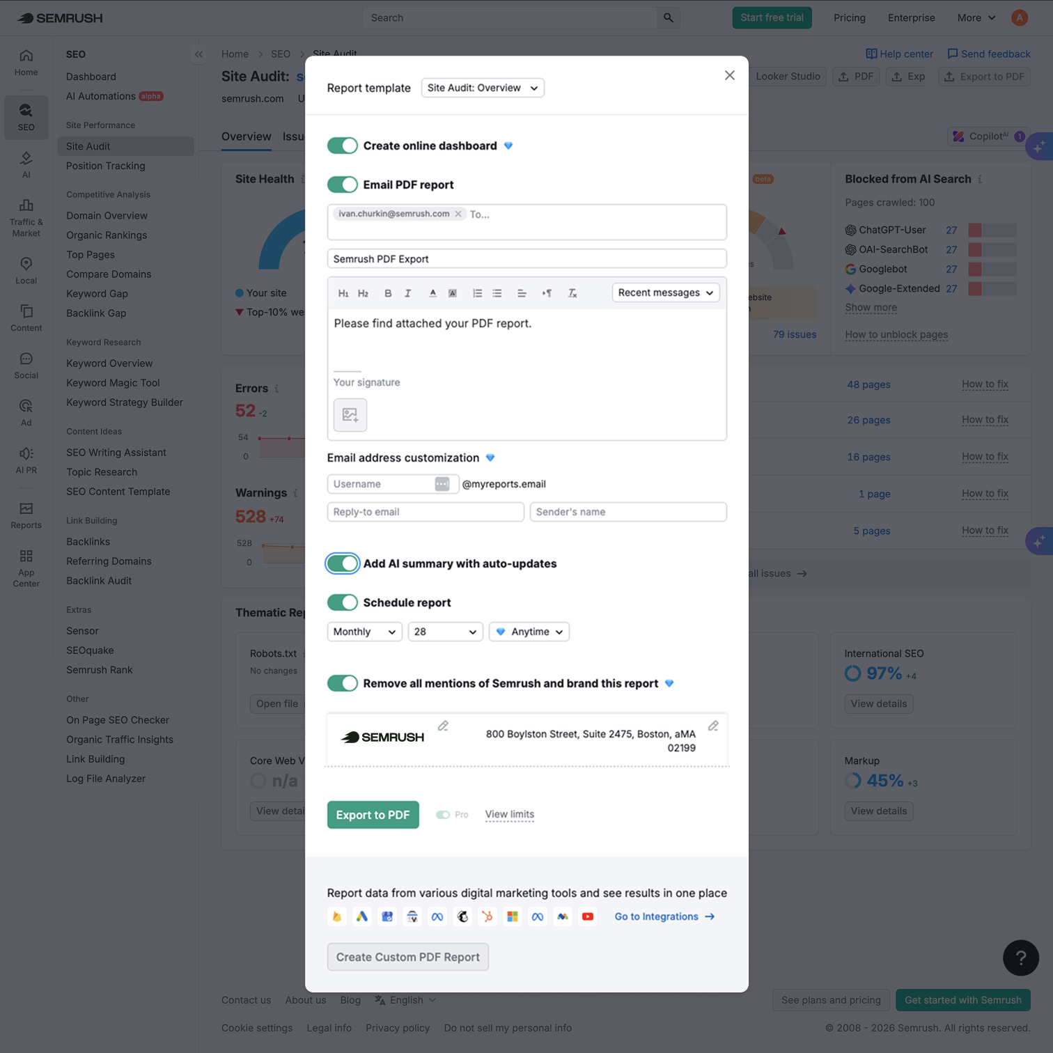
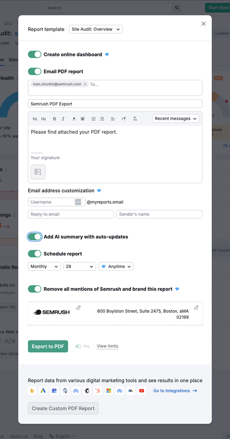
We needed to scale and add new scenarios — which was impossible because of the extremely cluttered interface and seven-year-old legacy code.
Process and result
In the early stages of discussion with the PO, we decided to shift from a very misleading one-button scenario to a multi-format export hub — making it clear and scalable. I made a quick rough draft — enough to keep the conversation going right away and move it one level down, from the concept to what it actually does:
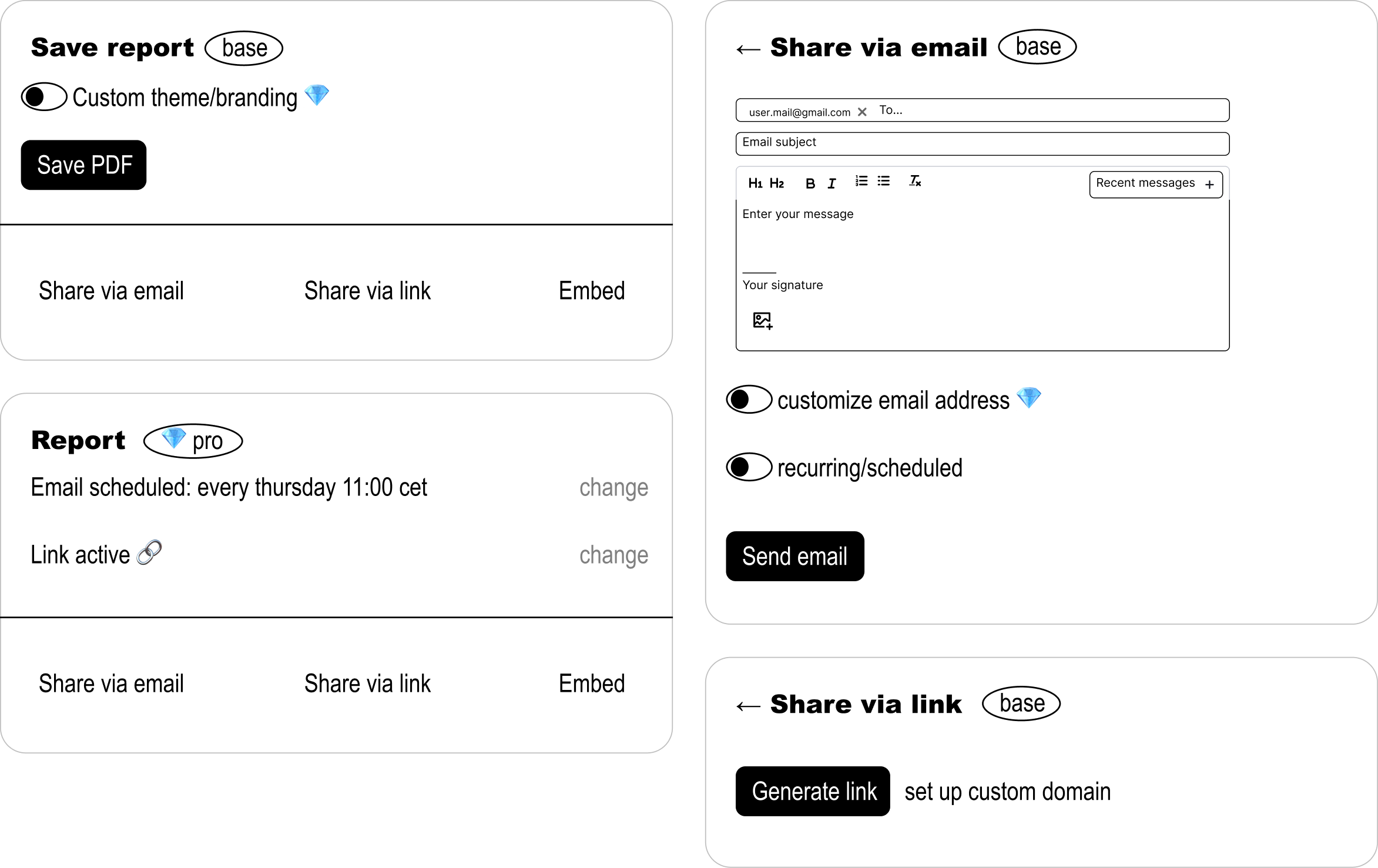
The code was structured around a one-button scenario. Together with the team, we took a deep dive into backend and frontend mechanics and how we could realistically change them, while staying within the constraints of the A/B test. It took us six one-hour grooming sessions. One thing we needed to measure turned out not to be measurable — our A/B platform couldn’t count specific items inside a GA4 ecommerce event. I took it to the team who build it, and they added support before we launched.
Most of the decisions from the draft survived into the final design. The main one: every export scenario became a thing of its own, instead of one more toggle in a wall of toggles. And AI Summary, our highest-converting paid feature, got its own place in the top settings block instead of sitting buried in that same wall.
I ran five hallway tests on a clickable prototype of the new structure to check that people read the split into separate actions the way we intended. All five did — including three who had never opened reporting before.
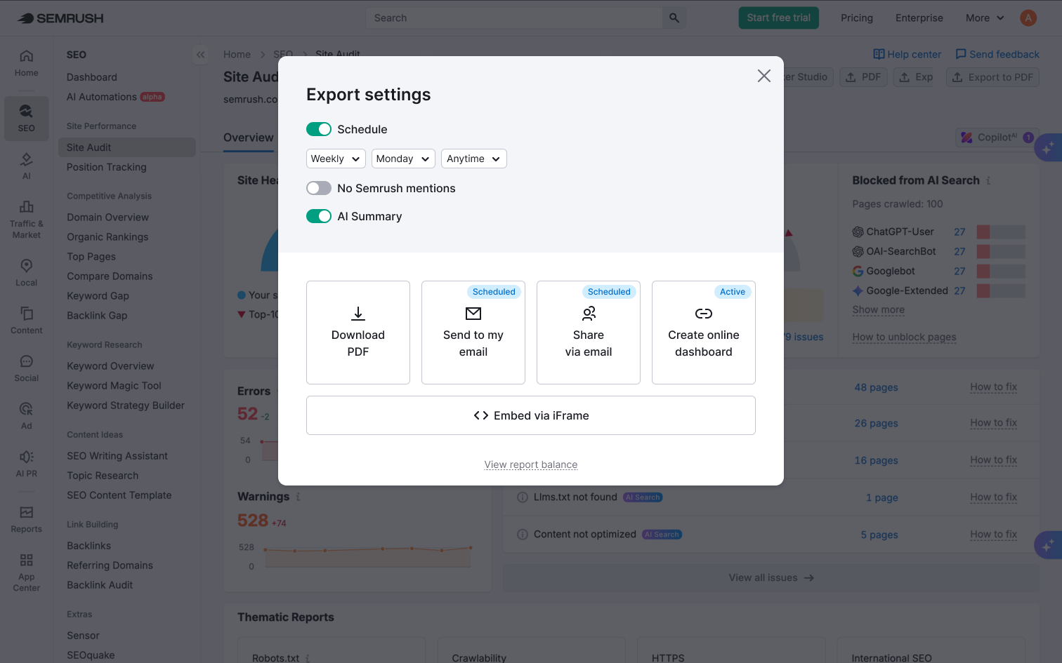
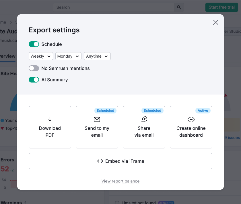
In the A/B test, export conversion rose from 58% to 70%, and the use of AI Summary grew 3.4 times.