semrush’s
data-driven
funnel map
case study
Problem and goal
The product had grown fast and become hard to see whole — we needed a map of how users actually move through it and where they convert, so we could plan where to work next.
Process and result
I started from the events. I walked through every page and checked what GA4 actually fired with a Chrome plugin, against our event spec table. I don’t write SQL, but I know our events and I check them on prod constantly.
Another designer on the team had built a tool that lets non-analysts assemble SQL queries. I used it to count every event, and then had ChatGPT — our analysts had fed it our database structure — assemble funnels out of those counts.
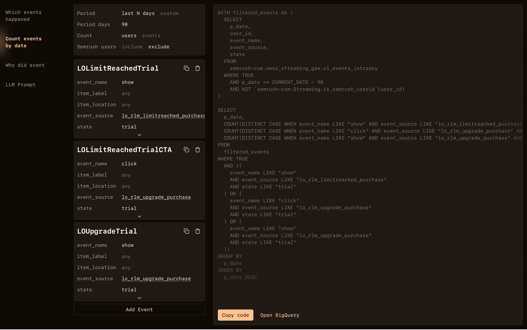
Out of that I built the map: how users move through our tools outside of reporting, what brings them into it, what they do next, which features they pay for and which ones underperform. The first version covered the three months right after our new monetization launched, 13 May to 13 August 2025 — plus a cut by new versus returning users, which turned out not to tell us much.
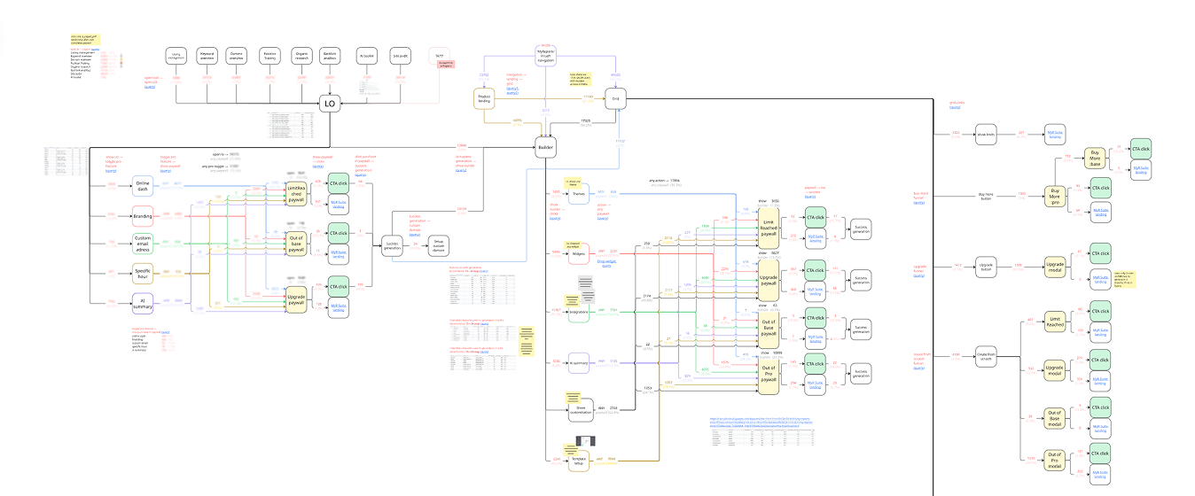
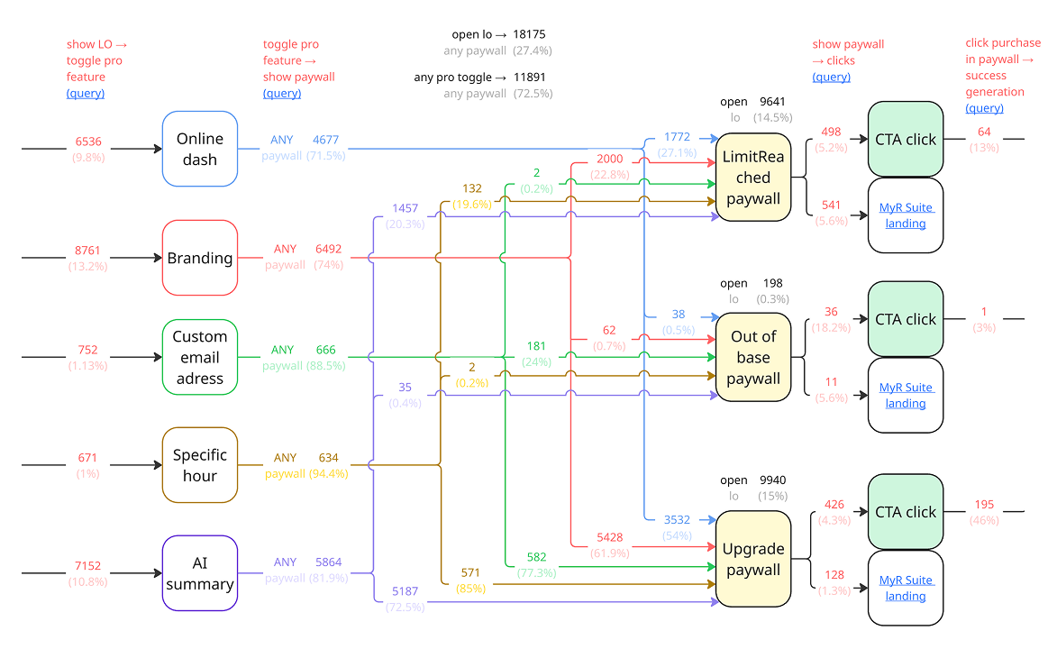
The PO and I used the map to plan the next scope of tests: paywall updates, trials, seamless upgrades and a free version of AI Summary — the feature that converted best once people actually reached it.
Some of that confirmed what we already suspected — I was drafting the new export flow while the map was coming together, and we already wanted to push AI Summary. The map made us sure, and showed us where else to look. We designed and launched those tests through A/B over the following months — some won, some didn’t. The ones that did raised paid report upgrades by 126%, paywall CTA by 7.6%, overall purchases by 21% and repeat purchases by 64%.
I keep rebuilding it — the current version covers October 2025 to March 2026. Nothing in it has changed our plans yet, which is its own kind of answer.