koshelek’s
core scenario
redesign
case study
Problem and goal
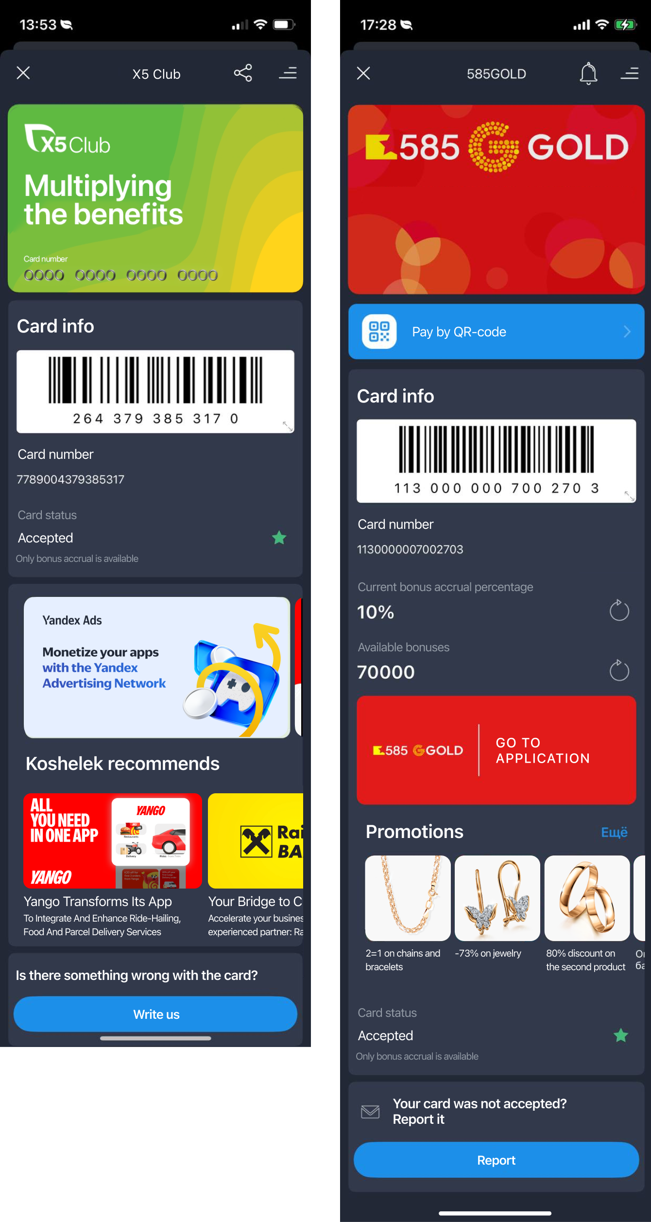
Koshelek app monetizes mainly through ad impressions, and even though the traffic in the main scenario is extremely high (around 11M users, 90% of MAU), almost nobody goes anywhere from it. Our B2B partners no longer wanted to pay only for loyalty card issues, as they did in the previous years — they also wanted traffic to their own resources. Back then that was no more than 1—2%. Here’s what this scenario looked like before the redesign:
Process and result
Along with the PO and a business analyst, I studied how this scenario connects to other teams’ work, and documented the data flow across frontend, backend and the card’s lifecycle. I ran in-depth interviews with seven users and confirmed the hypothesis: all seven saw the app as card storage and opened it only to show a card at the checkout.
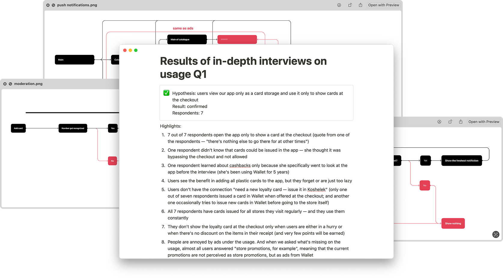
We decided to reposition this scenario for the user, from a screen with their loyalty card to the place that answers the ‘Why should I go to the store now?’ question.
I redesigned all the resources we got from partners, moved them higher and presented them in ways that worked better for the user. We shipped experiments every couple of weeks.
On the new screen, promotions CTR rose by 205%, users went through to partners’ resources 97% more often, and ad impressions rose by 58%.